
Usable UI, where has it gone?
Recently, I’ve been thinking a lot about this topic. Maybe I’m getting old, not keeping up with the times, or I flat out just don’t get it. I would argue that this question trickled into my head years back when companies like Apple and Google made a shift to “Flat” UI/UX designs, away from skeuomorphic and realistic interfaces. While I understand the limits that come with basing interface design off of real life objects, the removal of such limits have caused a different problem.
You see, in the tech industry, the public and the market have started to expect new innovation (I hate that word) every year. It has to look different, even if it does the same function as the prior version. All I want to ask is “Why”? What was wrong with the prior versions? Let me give, what I believe, to be a great example of an app that hasn’t changed too much over the years. That would be the Contacts app on iOS. It performs three functions: organizing contacts, adding new contacts, search for existing contact.
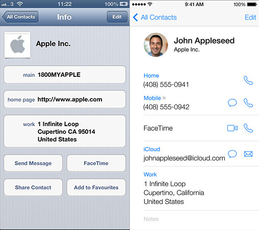
Courtesy of Matt Gemmell
While the image above is comparing iOS 6 to iOS 7, the change is not that different from iOS 10 (the current version as of this writing). Mostly just flattening out an already defined paradigm. It also improves on the navigability of an already straight forward system by adding icons for buttons.
Now, I’m going to move to an app that gets a lot of heat. Sorry to beat a dead horse, but we are going to turn our attention to iTunes.
I also got to see how incredibly ancient Lion and iTunes look today. (Although navigating iTunes was much faster and easier than today’s.) pic.twitter.com/knQKE0c2Gy
— Marco Arment (@marcoarment) September 26, 2016
From the tweet above (courtesy of Marco Arment) you can see iTunes from OS X 10.7. And below, iTunes 12.5.1 from macOS Sierra 10.12.
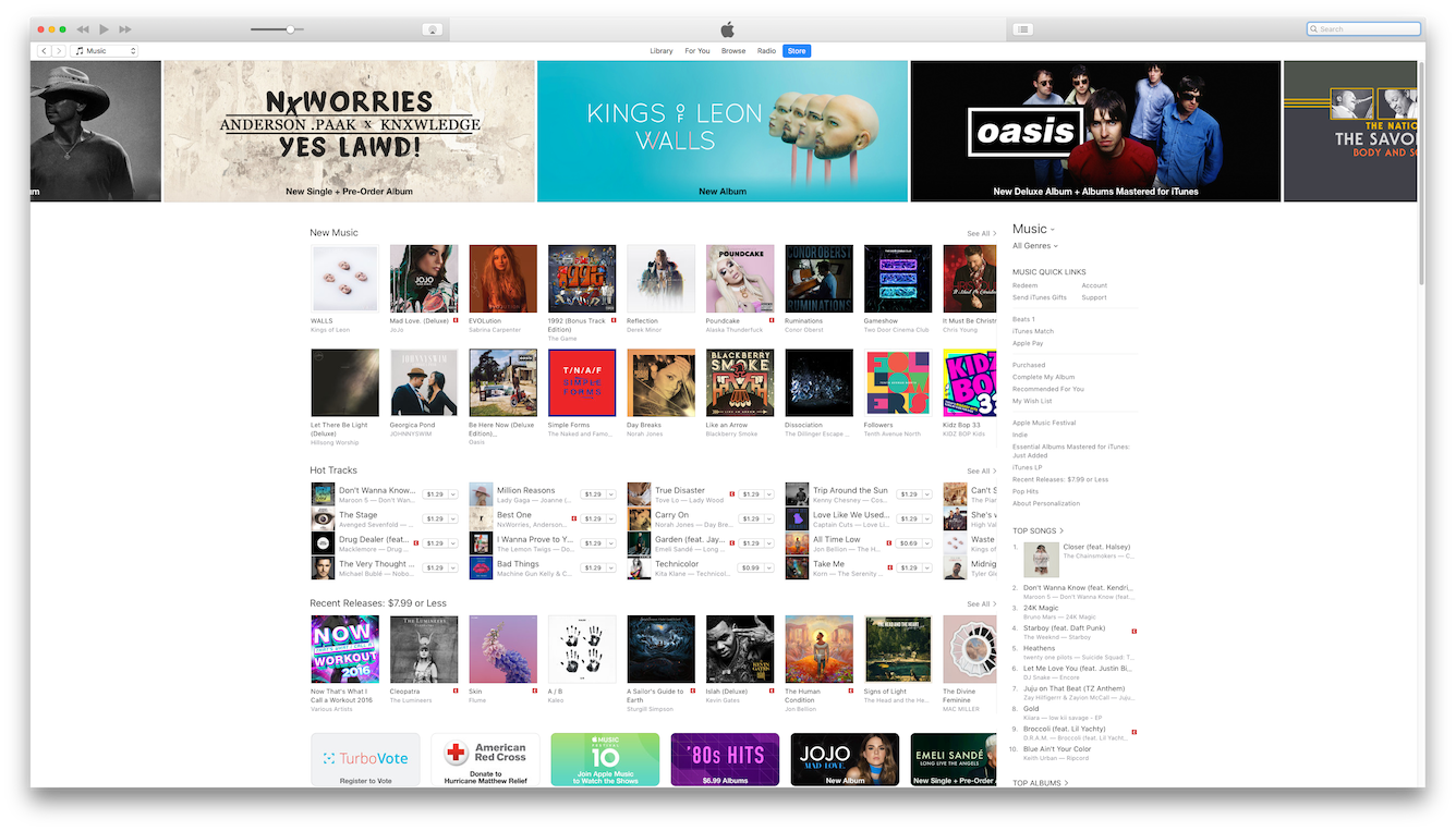
If I were asking you to create a new playlist and add a song to the playlist, I would be willing to bet you could do it in the earlier version of iTunes faster than in the later version. Even if you had never used the earlier version. This is attributed to discoverability built into the UI. That is, users can look and easily know how to navigate.
As UI/UX design has moved forward, there seems to have been a shift away from discoverability in the classic sense. I would wager the word means to go out and have to discover and find through exploration. Where as this may lead to a cleaner look and aesthetic, it masks the usefulness of most software from the layperson or common user. If I have trouble finding out how to add something to my Library using Apple Music, there is a really good chance my friends and family won’t figure it out.
Here is one of my favorite examples of poor discoverability. In the Photos app on iOS, there is a new face detection feature where the system will scan your photo library and learn who people are using machine learning to group similar looking faces. What happens if a face is grouped in that doesn’t match?
For examples sake, let’s take this picture of me. If I am looking at the picture, here is what I see:

Now I ask you: How do you select this picture to be removed because it is a mismatch? Trick question, from this screen you can’t. Why? I don’t know. Want to know how you do it? You have to do it from the prior screen where you see photos.

 Again I ask you, how do you remove a face? Do you give up?  To remove a face from the learning algorithm you have to tap on the “Share” button. That’s the one with the square and arrow pointing up. Why is this only available from this screen? I want to know how anyone is suppose to figure this out. I happen to figure this out because I did have faces incorrectly grouped. I sat there for 10 minutes tapping around until I found it. I guarantee you none of my friends or family will figure this out without asking me. It isn’t intuitive, it is not user friendly, and detracts from the experience. Also, you can bet I will be filing feedback or a radar against that after this post.
While I used Apple as my target for this rant, it is because I am most familiar with them. That’s also because I found Google and Microsoft to have unintuitive designs to start with. Both have made great strides in recent years, but each contribute to different problems (which I may or may not cover in another article). My point here is that change for the sake of change is bad, and I would like to see a stop to it. Sometimes, and I’m going on my own personal feelings here with no credibility backing this statement, it feels like the designers are running things at software companies now, and engineers have no say.
If you are an engineer, and you have an opinion, you most certainly should argue your point if you know you are right. And by right, I don’t mean right because you find it easy. I mean right because your friends and family would find it easy. If they can’t, then who are you really designing your software for? I would like to take this moment to put out my personal view on this topic when it comes to UI/UX design from an engineers perspective:
- Look at what has worked. If it works well, why change it? Does the new design offer anything of greater benefit?
- Keep user interaction to a minimum. I don’t like to have my designs cost a user more than 3 interactions max. Why? Because I personally won’t look past that number, so there is no way my users are going to get there.
- Know when to throw out bad design. It helps no one to keep it as is and pack more in (I’m looking at you iTunes).
And last, but not least, don’t be afraid of being opinionated. State your point, make your arguments. Even if your design isn’t the right design, you may be vetting concerns that otherwise wouldn’t be vetted. This can lead to a better end user experience because others must look at the points you bring up. Design is collaborative, not single sided.